I then had the issue of figuring out how I was going to include the E4 logo into my chosen Space invaders frame. the process went a little somthing like the following.
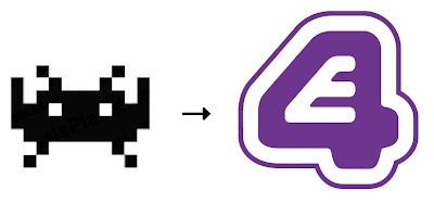
I decided instead of copying the entire space invaders theme, including the famous aliens i would replace the aliens with E4 logos. this gave me a way to include the E4 logo seemlessly into my work with it just being an addition to the work.
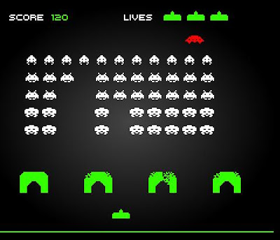
here we have the original formation of the Space Invaders game, now that I know I want to replace all of the Aliens with E4 logos another problem sprang into my mind, well not so much a problem, more of an observation, in that there is clearly more than 1 kind of Alien in the game, 4 different kinds 5 rows with a special flying saucer that goes across the top of the screen.

to avoid the scene looking too repetetive I thought of a way to get round this small issue. I remembered that E4 has a neighbouring station like many of the popular television stations E4 has a +1 channel incase you missed something on the original station. So when doing further research into the channel E4 i found that there were more stations, and each station has a logo that was a alteration of the first. E4 also has a music channel call 4Music I didnt use this logo just incase I confused the veiwer. so there i had 3 Logos for three "Aliens", better than just 1. Also when doing reseach i have found that the logos are also commonly seen inverted as well, and by this I mean the places where they are commonly white are made purple, and visa-versa.
So I was liking my idea of the E4 Invaders more and more, but using the logo as it is was not an option, it didnt look at all retro and infact looks more modern than most other logos.
Realising this I made a "retro" version of the E4 Logo in Flash, I used flash because Vector programs utilise block colours much more efficiently than Raster ones do and the only colours I needed were Purple (#6D378F) and white (#FFFFFF)
E4 Retro Logo
Of course using this image I figured out a way to get the other 2 logos to be the same way, I really like how these turned out, I was a little frustrated at first because I didnt know how I was going to make the logo appear to be "retro".
E4+1 Retro Logo
E4 HD Retro Logo

Story Boarding
so with lay out and design of the most important facets of the sting done the rest was just trial and error, this is the first Storyboard I did.
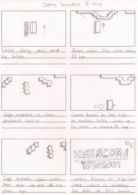
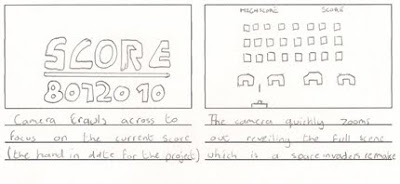
After speaking with Alan about this storyboard we agreed that because the time span of this animation is very very small that I should "give it to them" (as Alan put it) sooner, meaning let them know whats going on sooner in the animation.
In the Storyboard i tried to match up to the audio while also attempting to hide a easter egg within the scene also. the layout however seemed to be snapping around too fast and the wouldnt allow anytime to appreciate what is happening on screen
(the Easter Egg is that the "High Score" number is actually the date of E4's release) due to the fact it would be far stretched to believe that sombody would make that connection I removed the addition of the scores in the reworked version to make it flow better.
Re-worked storyboard
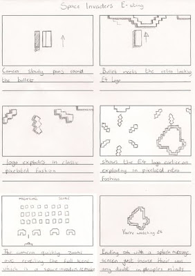
I removed the unneeded cells and replaced them with a close up of the E4 logo's in their 3D form being destroyed by an (as of yet) unknown force which then makes the camera more suitable to zoom out and display the agressor, revieling the scene and the meanings behind the quirky logo's.
Since I already had the Logo made I decided to do the ending splash screen first, not having the font i wanted meant looking for it, which didnt take very long and I found an acceptable type face on 1001 free fonts dot com.
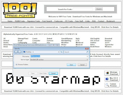
using a purple Radial gradient, the Logo and the new font i was able to make the end screen for my animation.
Maya
within Maya since the scene was all laid out in 1 place I quickly assembled the basics, the odd house-like shelters and the player controled cannon before moving on to the Logo construction itself.
the odd thing about the construction of the scene was that I actually found it harder trying to make everything look retro than i perhaps would have just making things normally, once i got the hand of it however it was fine,
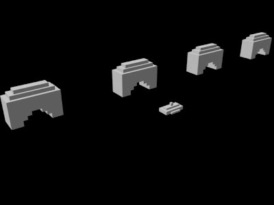
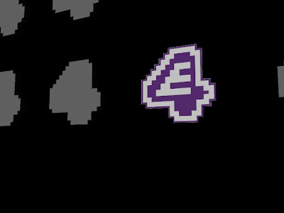
afterwards I started on the actual 3D logo, making it as close to the Concept as I could so I could kill 2 birds with one stone using the concept also as a texture.
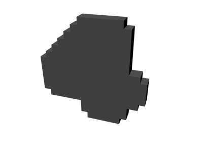
I rendered the 3D logo in front view and overlaid the resulting image with the concept version in Flash, making sure they layered up perfectly all that was left was placing the texture onto the model and making sure the UV was set to "Planar map" the result was very pleasing.
I did this for all the varients of the E4 Logo and then set up the "invaders" formation each were set 3 grid squares away from one another left to right, and 2 grid squares top and bottom. (from the front orthographic perspective)
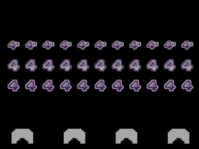(Final).jpg)
I added a backdrop, since most of the Estings I had seen focused only on purple and white I decided to do the same, making the forground elements white on a purple back ground.
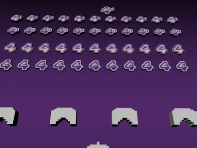
The Background remained hiden whilest working on the scene since i repeatedly selected it during my navigation around Maya and it was driving me crazy. A
All that remained was the animation for the scene and the movement of the camera, I did encounter issues between conflicting frame rates between Maya and After Effects.
I modelled and tested the "explosions" effects for my scene, I tried to make each arm of the explosion a little different so it didnt look so mirrored but yet still leave it looking pixelated.
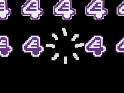
In the Maya preferences I had set the frame rate to be 25 frames per second, and also done this in the After effects scene that was now open, unfortunatly regardless of what I did Maya would only batch render my scene at 29 frames per second, which led me to despair a fair amount and meant that I couldnt correctly mastermind the operation to 100% precision, regardless things seemed to work out if I let the animation run a little over the desired time and left the rest to post production editing in AE.
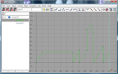
after setting the animation markers to make the movements of the in scene elements i retreated into the graph editor to remove and slow downs and rev ups in speed due to unwanted curves between the keyframed animation, all the lines had to be perfectly straight going directly to the next keyframe directly.
.jpg)
After Effects the only problem I encounted in Post was an error I recieved when Exporting the scene due to a faulty MP3 codec plugin, since I use After Effects 7 this could be the reason, due to this it would not let me render. fortunatley i had encountered this issue multiple times during other pet projects. how to get round this was simply to convert the MP3 to a WAVE audio file, and then the render finished perfectly with no further errors.
Final video